BUSINESS LOGOS
Hungry Jacks
I don't personally like these colours, but the use of red and yellow work effectively together in this particular type of logo because the colours are associated with food and eating and therefore sell the product they way it is intended to. It is also associated with chips for yellow and red for sauce.
 |
| This red is bright and vibrant |
 |
| This shade of yellow reminds me of the french fries |
Fitzpatricks Real Estate

 |
| I really like this shade of blue - it feels fresh |
According to the colours of pyschology they have again chosen appropriately to what they are trying to sell. Blue shows authority and success which is what you would associate want to associate with a real estate. The white writing apparently indicates truthfulness, amongst other things. They added the splash of colour using red orange and yellow to show passion/drive, affordable and happiness.
Romanos Hotel


This purple would add a touch of elegance and fun this the black.
World Vision


Orange isn't all that an appropriate choice of colour in terms of the psychology. It represents enthusiasm, fun, high spirited and youthful. I would think that the use of green and white would probably be a better choice as green is associated with health, environment, harmony and tranquility which I would have thought would be more appropriate to world vision. White also adds innocence, peace and purity to the mix.
Wagga Marketplace
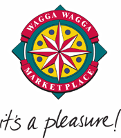
I think this is a poor choice of colours particuarly the red and green - Green represents more of an environmental feel and health and harmony which has nothing to do with this business. Red is action, energy, strength and doesn't capture this business either.
I think blue would have been more suitable with yellow and white would have been a better fit -

Wagga Paintball

 Orange is a somewhat good choice for this type of logo as it represents fun, youthful, enthusiasm but It think red would do as good if not a better choice of colour because it represents passion and energy, excitement and strength. I think that you would be more drawn to the colour of red then orange as it doesn't stand out as much.

No comments:
Post a Comment