Pros
- I like how they have etched cottees into the glass around the top neck
- I like the shape of the jar and size
- The font of cottees is familiar and well known
Cons
- It's glass therefore easily breakable
- I find the label extremely boring to look at
- The colours don't appeal to me at all
- It just looks like another glass jar of "whatever".
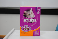
2. Whiskas Cat Biscuits
Pros
- The cat they use is cute and appealing stating what it is for.
- Whiskas brand is well known.
- I like the opening side where you can pour the biscuits out.
Cons
- The colours are garish especially when used in this combination.
- Nothing at all appeals to me about the box in terms of font, colours or layout.
- It seems generic like any other box of cat food.
- It doesn't say that it is cat biscuits it assumes you know because there is a cat on the box and the brand whiskas.
3. Charlie's Honest Quencher - Raspberry Lemonade

Pros
- It is a very simple layout
- The font on the back is quirky and appealing to me.
- There is a little story on the back which is entertaining.
- I like the size and shape of the bottle.
- I like Charlie's etched into the plastic down the bottom of the bottle.
Cons
- Bottle is clear and hard to read.
- The label is hard to read when empty as it is clear, white with a hint of red.
- While the label is plain, it is also pretty boring to look at.
- Without a label on this item it could be any product at all.


No comments:
Post a Comment